

Post by marchesarosa on Dec 1, 2011 10:22:53 GMT 1
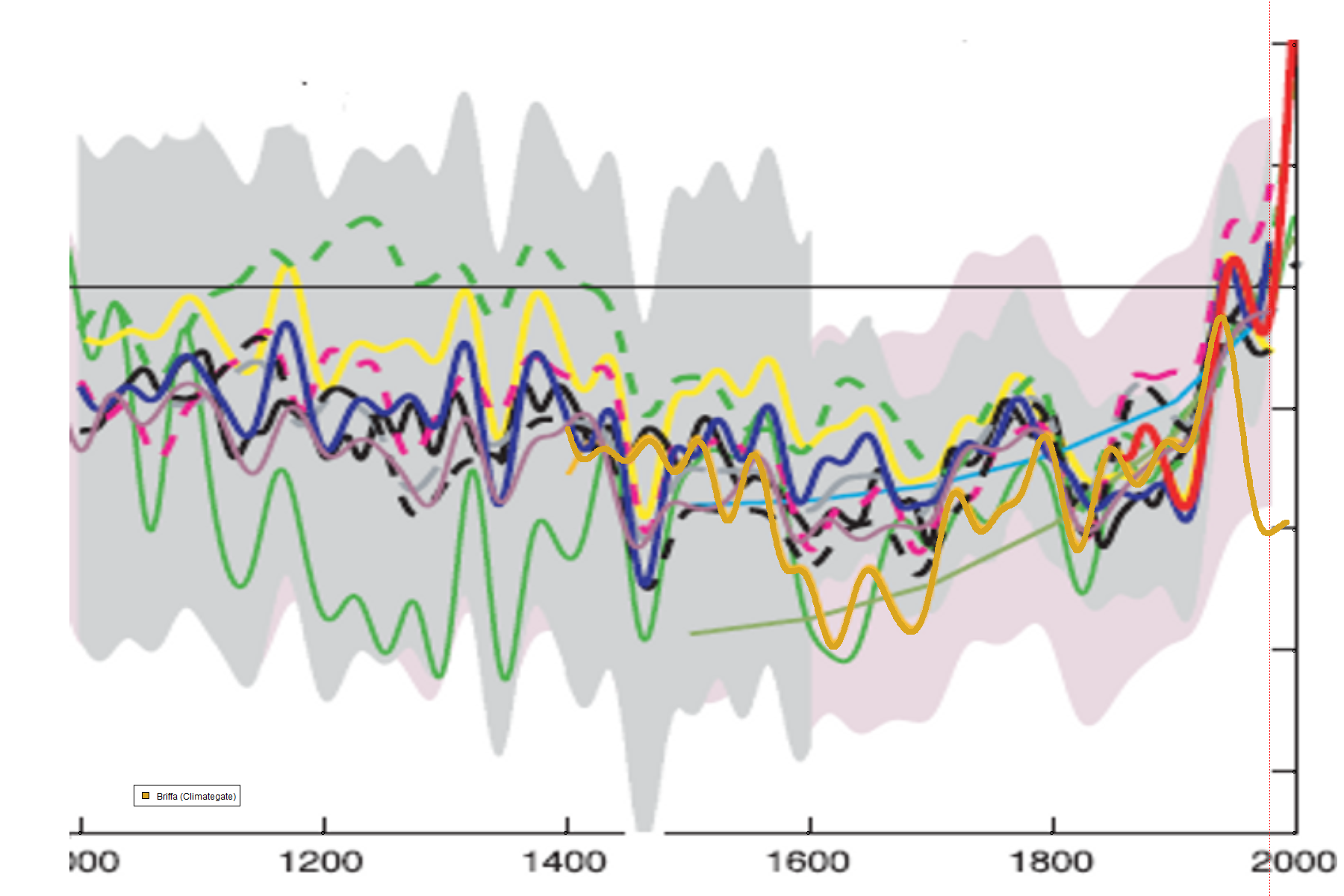
The first "spaghetti" graph shows various paleo proxies for temperature over
the last one thousand years alongside the (red) instrumental (thermometer) record.
Note the orange line plummeting downwards. This is Keith Briffa's (of CRU) tree-ring chronology.
If you look at the close-up in the second image you will (just) see where Briffa's chronology
is chopped off in 1941 to support Michael Mann's global warming storyline.
This is commonly known at CRU and in sceptical circles as "hiding the decline".
Those of you actually understand what you are looking it will note that Briffa's orange line
tracks pretty well the known facts about the Mediaeval Warm Period and the Little Ice Age
and then doesn't track the purported rapid rise in temperature of the late 20th century.
So what are we to make of the unexpected "decline" in the tree ring proxies after 1940?
You may well ask. This "decline" has never been explained. How very UNcurious our
IPCC paleodendroclimatologist pals are!
Some (like me) conclude that the evidence of the post 1941 "decline" undermines ALL claims
that treerings can be reliable proxies for temperature
(treemometers).
So where does that leave the paleo-proxy studies which rely almost exclusively on tree rings
for their famous, alarming "hockeystick" shaped representations of recent
purportedly "unprecedented" temperature rise?
---------
See Steve McIntyres 2010 paper on the subject here
www.climateaudit.info/pdf/mcintyre-heartland_2010.pdf
and the latest discussion on the controversy at Climate Audit here
climateaudit.org/2011/12/01/hide-the-decline-plus/

